Julie Anna Lewis
-
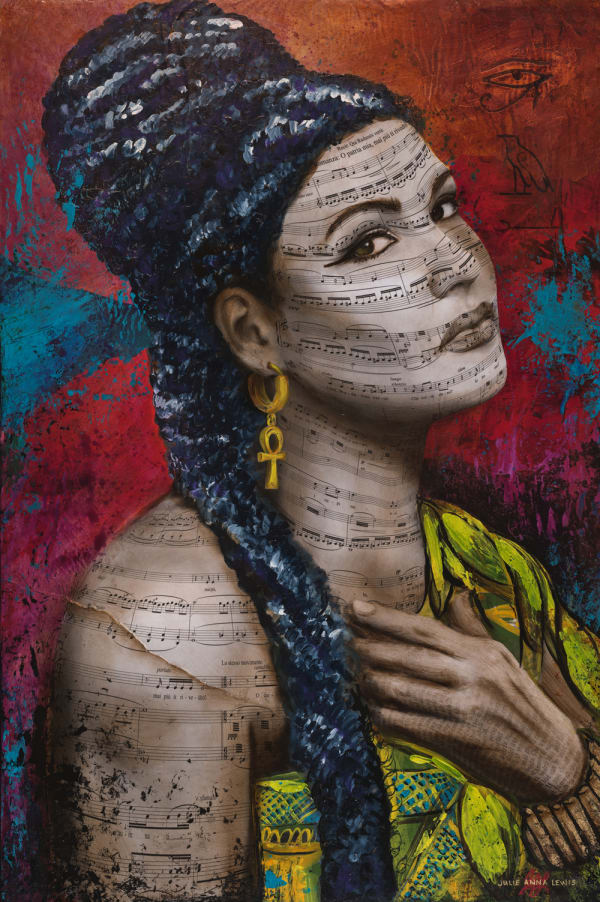
 Aida
Aida -
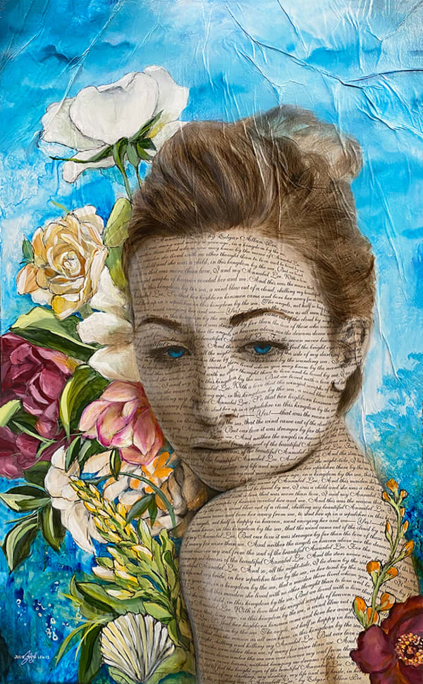
 Annabell Lee
 -
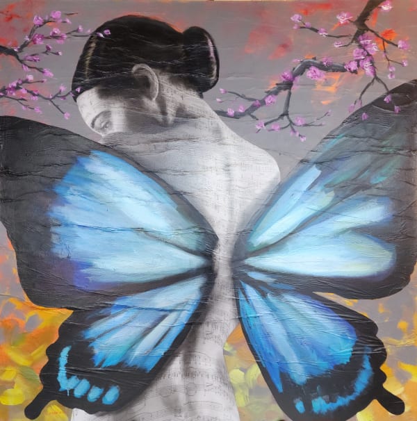
 Blossoming Madame Butterfly
 -
 Cascade
 -
 Cho the Monarch
 -
 Clair de lune Mountains
 -
 Despina
 -
 Donna Anna
 -
 Dream Window
 -
 Enchanted
 -
 Enchanted III
 -
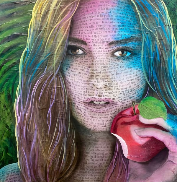
 Eve
Eve -
 Filigree
 -
 First Blooms
 -
 Floral Mayhem
 -
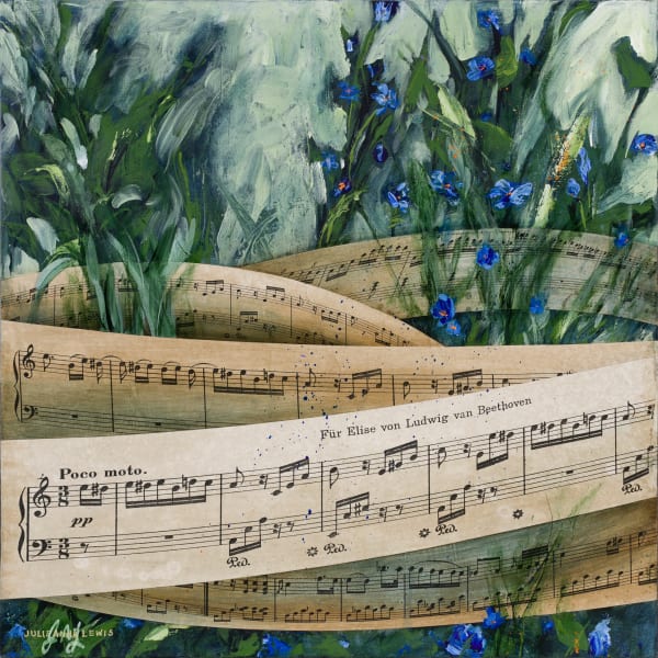
 Fur Elise
 -
 Garden Evening I
 -
 Garden Evening II
 -
 Habanera
 -
 Haidee
 -
 Hamlet
 -
 Harmony
 -
 I Do
I Do -
 Juliet is the Sun
 -
 Little Garden
 -
 Moby Dick
 -
 Music in Bloom
 -
 Ode to the Nightingale
 -
 Oh Deer
 -
 Owldorable
 -
 Purple Rain
 -
 Ring of Fire
 -
 Silver Blossoms
 -
 Silver Dreams
 -
 Silverscape
 -
 Suzel
Suzel -
 Take Me to the Ocean
 -
 Tangled
 -
 The Spirit of Cosi Fan Tutte
 -
 Titania Fairy Queen
 -
 Tosca
Tosca -
 Tranquility
 -
 Vitality I
 -
 Vitality II
 -
 What's Love Got to Do With it?
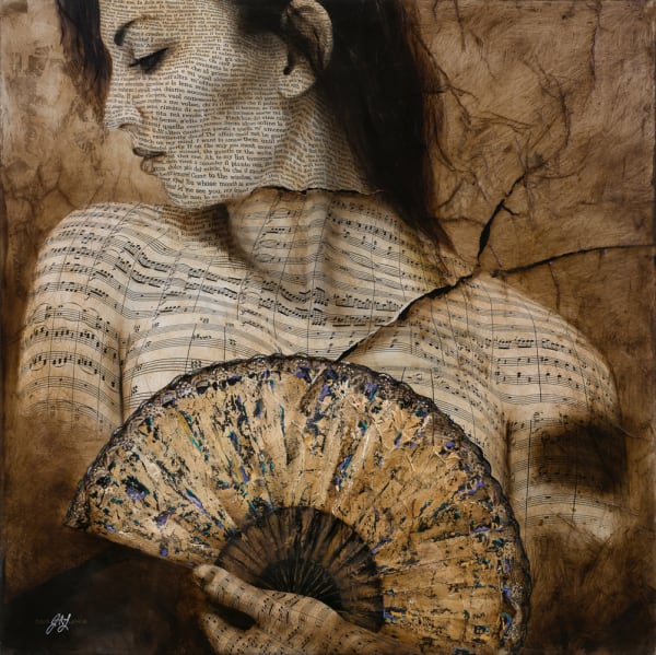
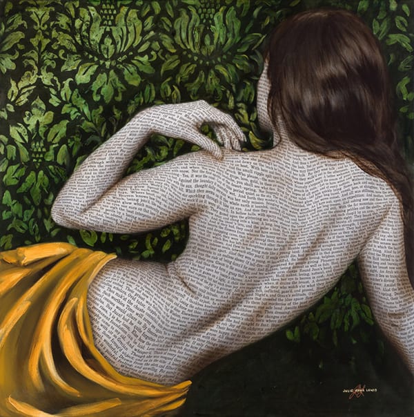
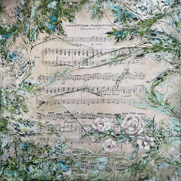
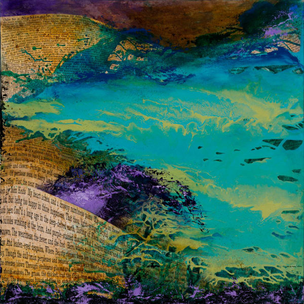
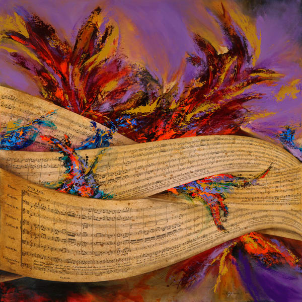
As I write this, I can attest that there is no other artist creating art in this way. Some artists paint on top of novel pages or music sheets, some super impose a photograph on top of words, but none like my unique method of sculpting text or music to fit the subject, giving it dimension.
I started out as a visual learner, an artist. I imagine I hadn’t any choice in the matter from the time I was small and remembered how my name looked, not so much how it was spelled. Letters and words to me have always been more than a language. They are shapes. I probably read much slower than most people because I am distracted by how words look — some are very pretty, some not as much. But I love them all. I would even look at a page of print and try to make an image out of the random white spaces. Words are language which is amazing in itself, then there being a way to communicate precisely by handwriting a series of “letters” to become words and words become stories, become messages, and become communication. A miracle! In working as a graphic designer, I am required to work numerous hours to perfect the look and visual aesthetics of an ad layout, logo, and trade show exhibit, etc. I can fuss relentlessly on the kerning and spacing, fonts choices and weights; Light, Roman, Bold, Italic, San Serif vs Serif, on and on. There came time many years ago when I wanted to go further. It was more should have an emotional connection and I wished to create that deep connection to the viewer of my artwork. Over the past years I strive to refine my own unique style with flowing typography and music bars. I finally landed some good results from my art studies using my theories on Sculpted Text and Sculpted Music. It is a direct influence from my career as a graphic designer, my love for typography and the world’s love for classical music and literary arts. Combined on canvas with paint, I feel I have found something very moving to me and to those who view my art. The text or music within my artistic subject matter is from beloved literature, novels, poems, song lyrics, music and Biblical scripture. I utilize my graphic design skills along with my fine art techniques to create works on canvas that can stir the soul; a long forgotten bible passage, a rhyme from childhood, song lyrics, a classic novel, a favorite poem—all these words bring about memories, fond feelings, and nostalgia. Some of the writings in my art cannot be read fully, and that is intentional. “I am not putting it there for one to read as a book--but to inspire one to read that book!” The words are there as a design element, to add energy to the piece and perhaps it will trigger a memory for my viewer.
“We all love to read a wonderful story. My art is a tribute to those wonderful stories and other articles of writing and music that; encourage, remind, inspire.”
